Livewell - NDIS booking review page
livewell is an NDIS platform that connects disability service provider, support workers and people with disability to deliver a full cycle care service. Livewell allows customers (people with disability or their guardian) to book for caregivers through the platform.
The purpose is to help the service manager review bookings from their team members and make a decision whether to approve or waive the booking for payment.
Initially scoped as a UI uplift, I saw an opportunity to go beyond just a visual refresh and address underlying inefficiencies in the booking review flow that impacted: speed, accuracy, and ultimately, cash flow for service providers.
The Challenge
While the interface functioned adequately, several pain points were slowing down service managers:
Important booking details were buried or scattered across the screen.
Lack of visual hierarchy led to frequent errors in booking approval.
The interface was not optimized across devices, especially tablets — a key tool for managers working in the field.
The goal was to minimise errors, reduce cognitive load, and accelerate the decision-making process — all without rebuilding the platform from scratch.


The approach:
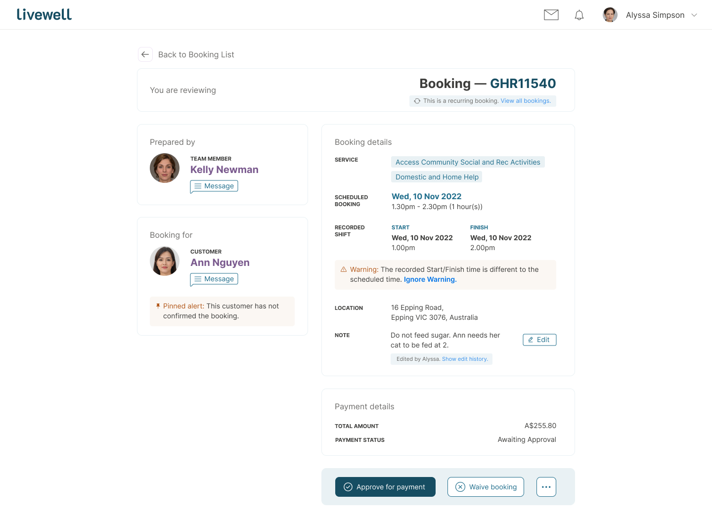
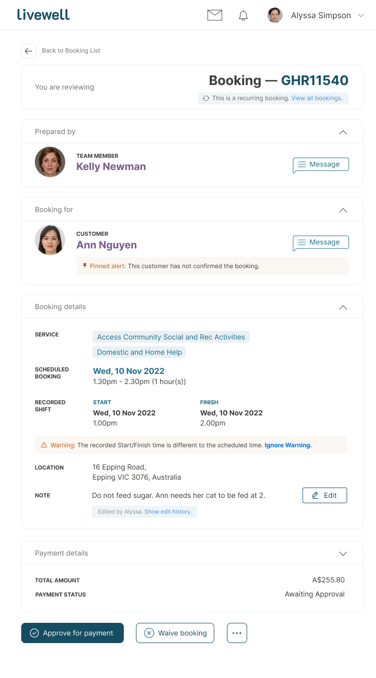
1. Information architecture - prioritise decision not layout
I restructured the content into five logical groups:
Booking metadata (booking number, status)
Team member details (support worker)
Customer details (person receiving care)
Booking details (location, time, service)
Payment details
This grouping was based on a workflow analysis, helping surface only what’s needed to approve / waive a booking with confidence.
On desktop version, I split them into 4:6 format so you can view all details of the booking without scrolling.
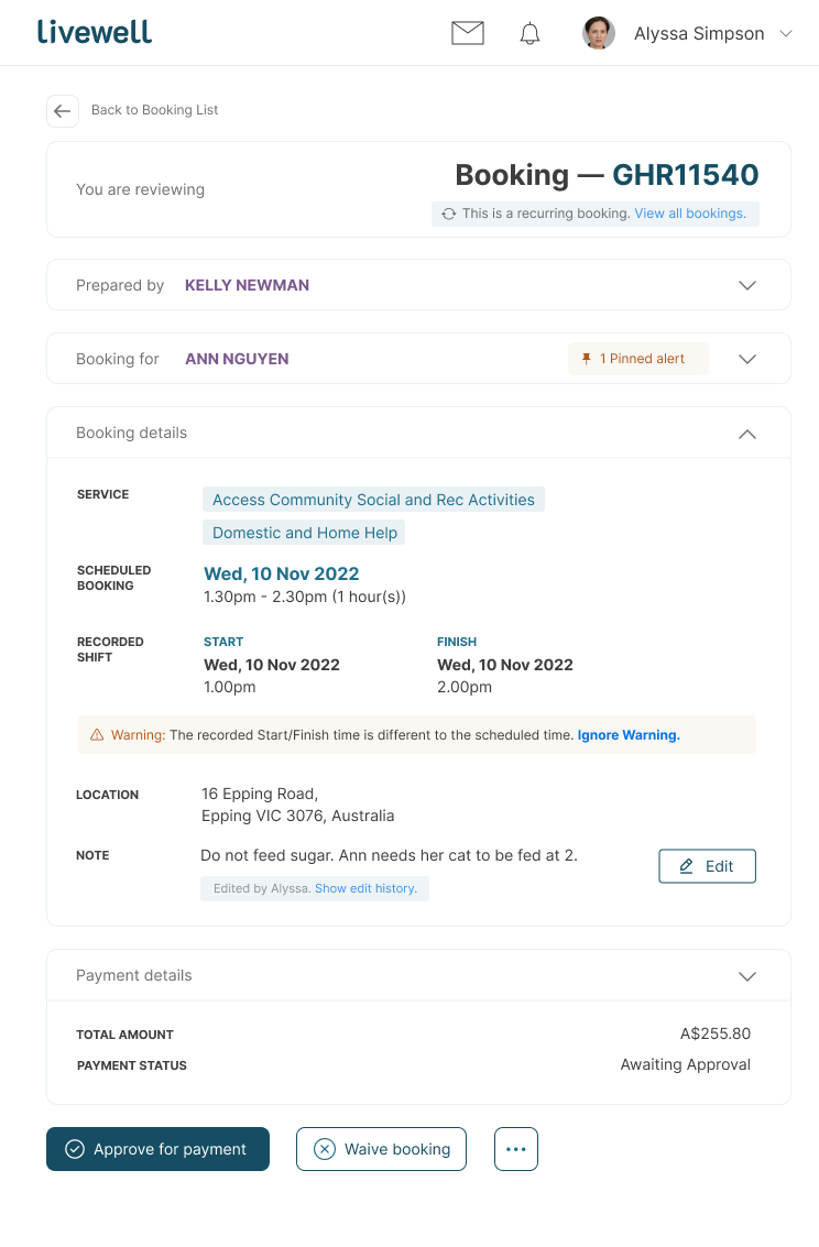
On the tablet version (image below), I reorganised these into a single column, prioritising content vertically.
To maintain access to key actions (approve/waive), I introduced collapsible modules, ensuring the primary CTA remained visible regardless of scroll depth.
2. Error prevention by design
I introduced:
Visual hierarchy to flag high-priority info (e.g. payment mismatches, double bookings).
Inline warnings/alerts for potential issues.
Editable fields that clarify status at a glance, reducing accidental approvals.
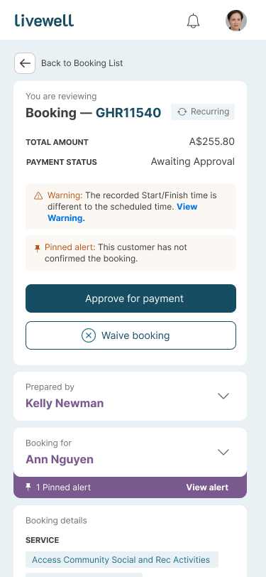
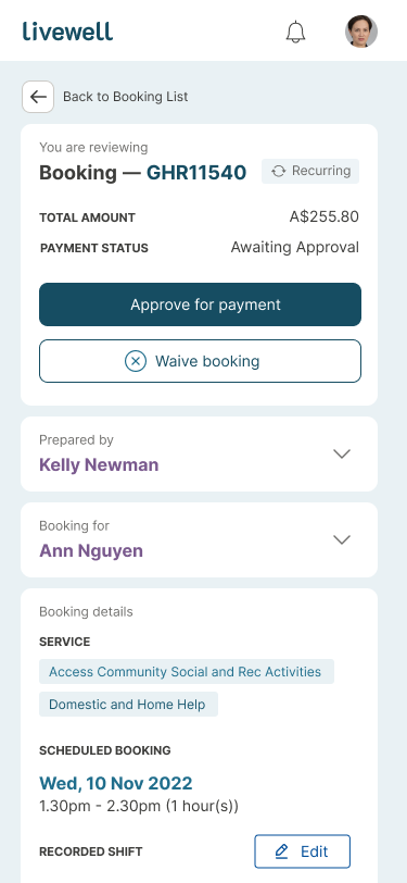
3. Rearrange information architecture on mobile - prioritise alerts and payment details
Mobile posed unique challenges due to limited screen real estate. I adapted the IA specifically for mobile to focus on speed and error prevention:
Warnings and alerts were placed at the top, giving managers immediate visibility into any red flags before proceeding.
Payment details were prioritised directly below alerts, supporting fast and confident decision-making.
Approve/Waive buttons were anchored near the top, reducing the need to scroll back after review.
Labels and metadata were shortened (e.g. “Recurring booking”) to maintain clarity without crowding the screen.