Shouta - A digital gift card in the form of Mastercard
Shouta is a digital gift card app that allows users to send and receive digital gift cards in the form of Mastercard that can be used anywhere in-store and online.
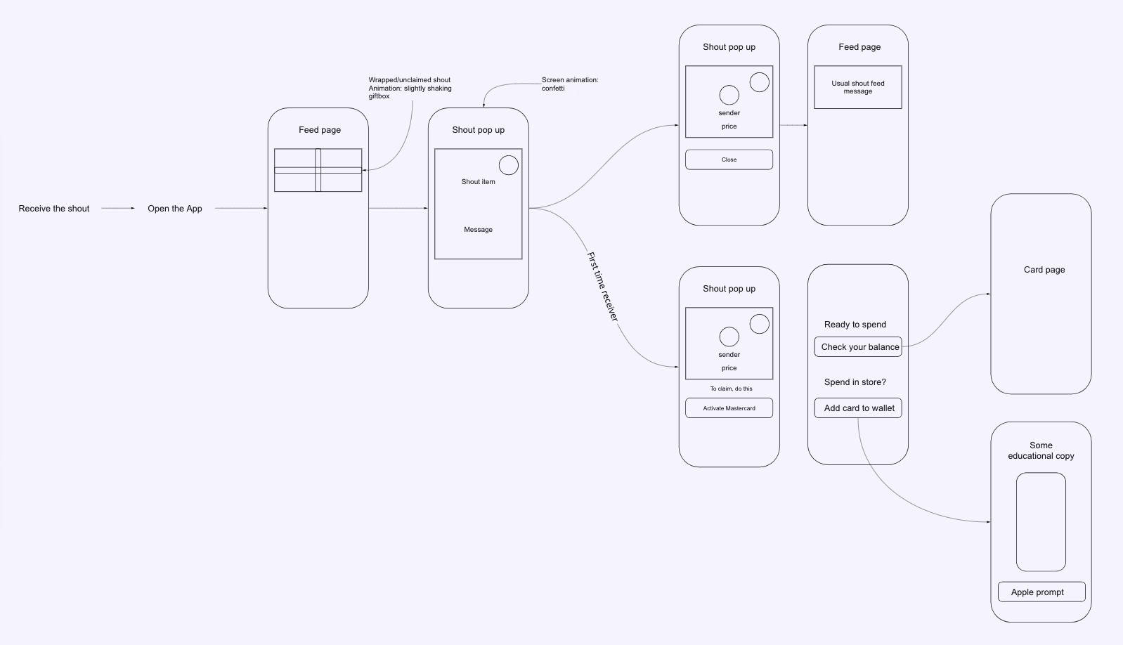
We’re looking at the card activation process. This flow is designed for first time users.
Where is my money? - complaints flooding in
First time users failed to grasp the concept of activating Mastercard.
Internal data revealed that first time users did not understand the need to activate a Shouta Mastercard to access the gifted money.
The receivers had trouble accessing their money and the senders were upset that their money was wasted.
We seemed to expect the users to understand the card activation. Hence, we lumped both actions - activation and add to wallet into one.
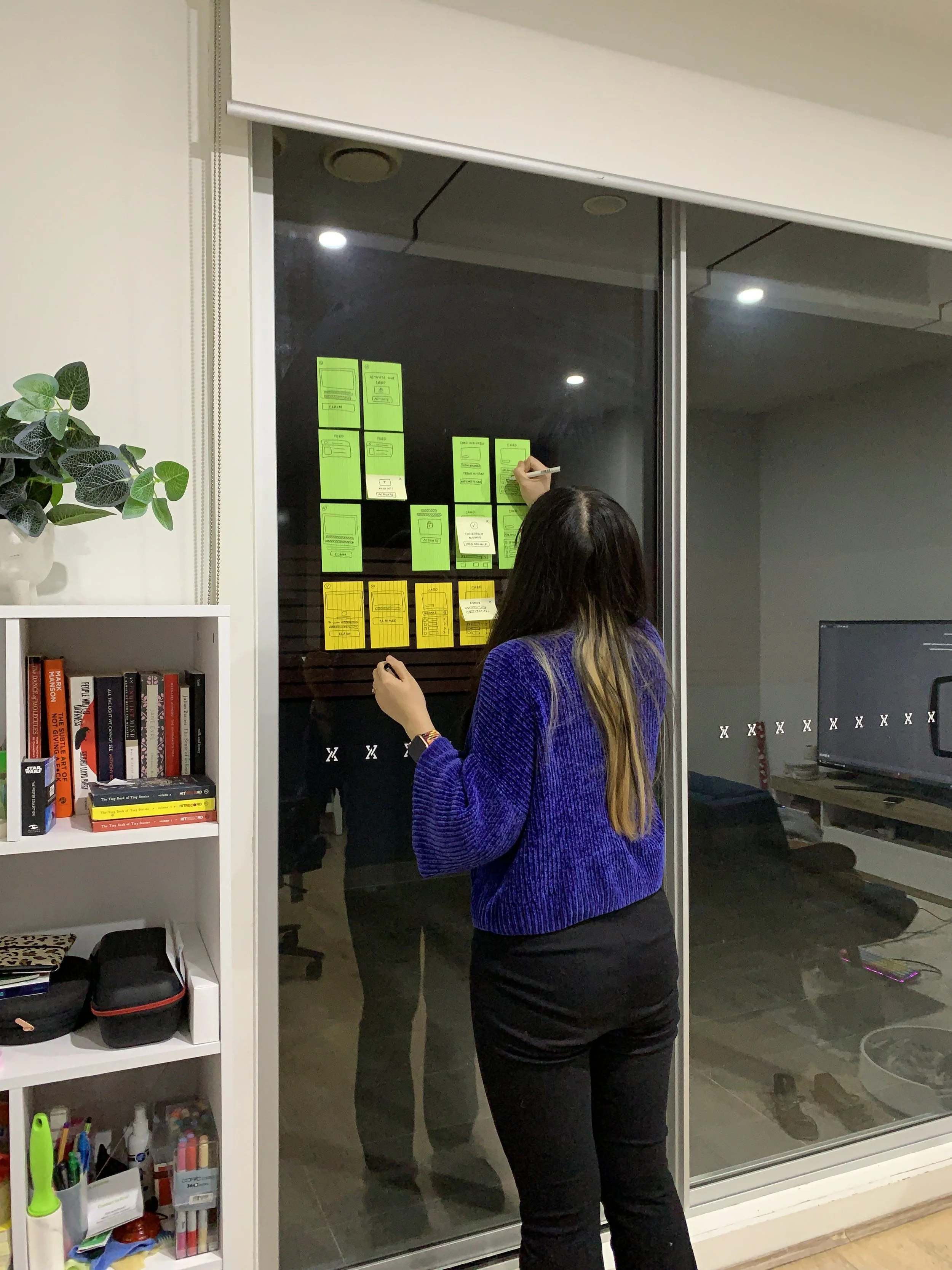
The team ran a design workshop to quickly define the users’ pain points surrounding the issue, which are:
There was no clear cut communication between two concepts:
(1) ‘activate a card’ - which allows money to be loaded to your card
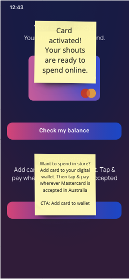
(2) ‘add card to wallet’ - which allows you to make contactless payment in-store.
Only the ‘Add card to wallet’ concept was communicated, which leads to confusion among users who do not use digital wallets or do not own NFC-enabled devices for contactless payment.
The instruction text ‘Add card to wallet’ was often missed due to info overload on one page.
Invalid error message pop-up is vague and abruptly stop users from what they wanted to do.
Question: How might we clearly identify the activation step?
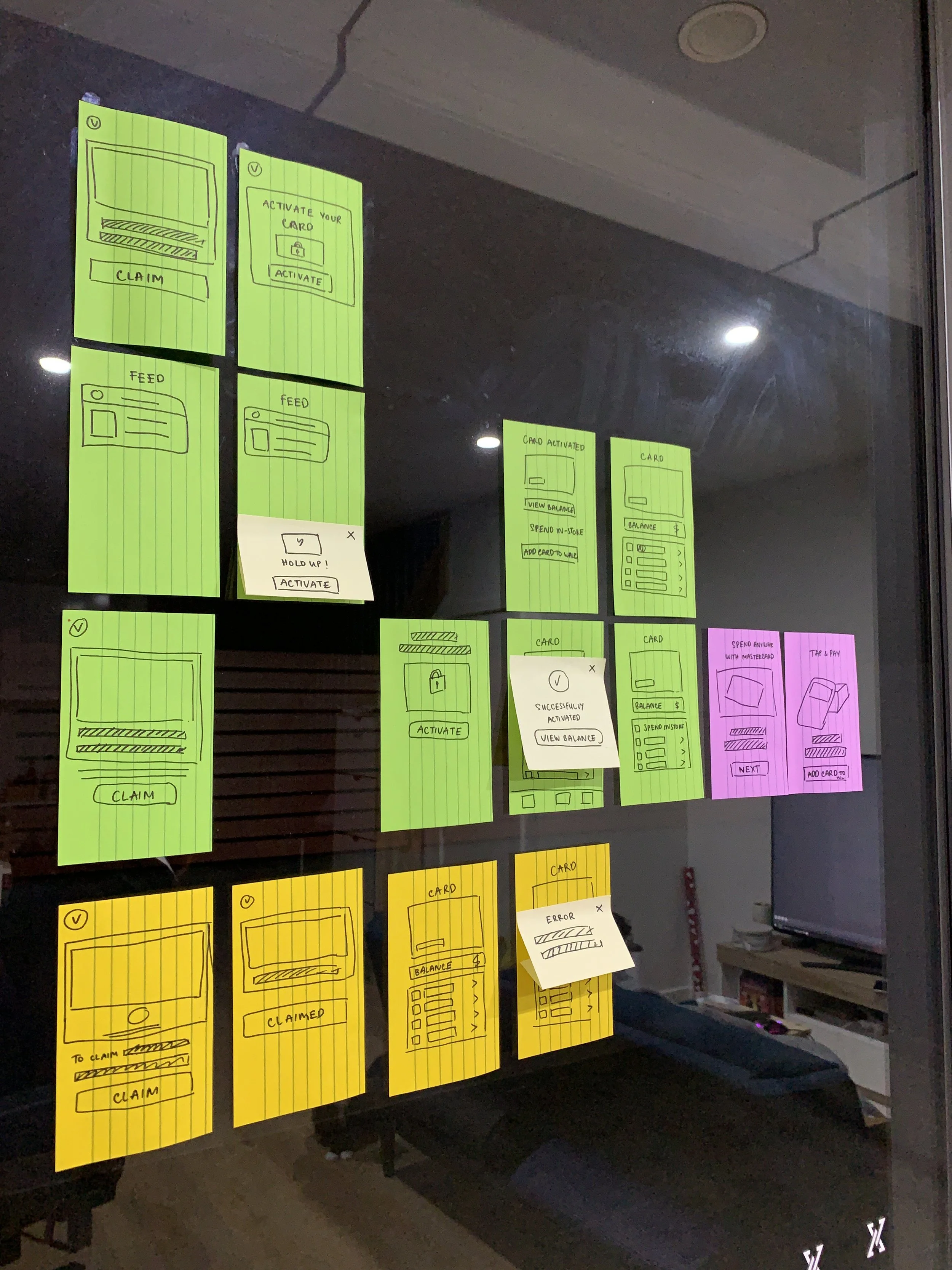
I started sketching out different ideas and solutions before presenting to the team. My solution focuses on:
Communicating ‘activating a card’ concept
Separating ‘activating’ and ‘adding’ card into two flows
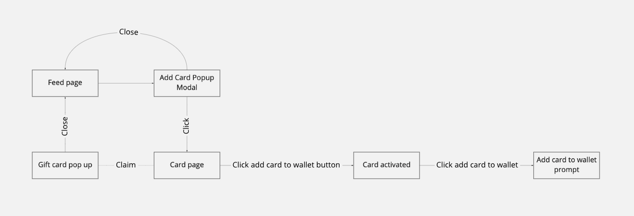
Existing flow: users were left to guess the next action
The biggest problem with our existing flow is assuming the users would understand where and how to access the money. There weren't any ‘holding hands’ or step-by-step instructions to guide them through the process.
The Add card popup modal is too frequent (popping up every 30 seconds).
The users are expected to know that they need to go to a certain page, click a certain button on the app to get the card activated.
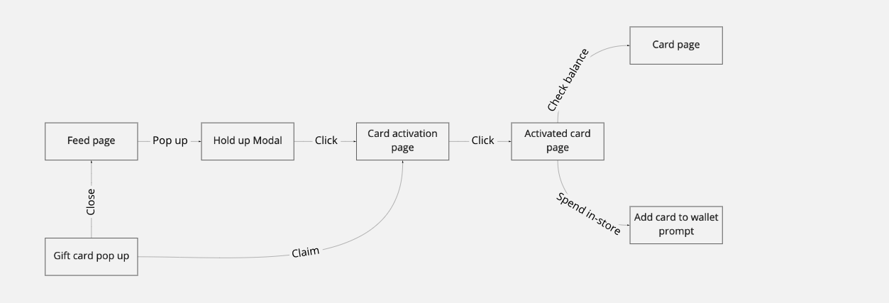
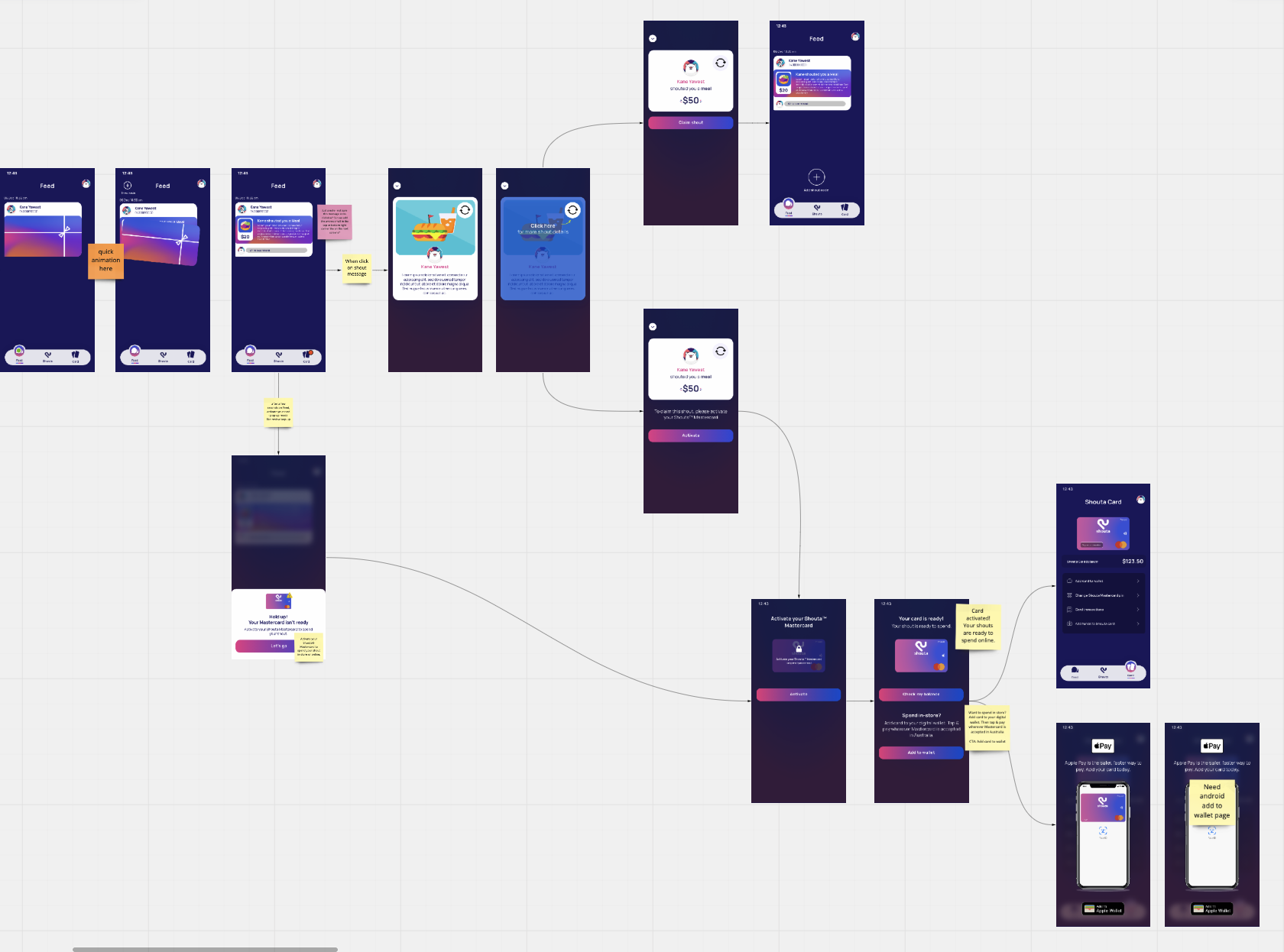
Updated flow - we hold their hands and introduce the activation step earlier
The concept of activating the card is introduced early in the process and allows users who do not use a digital wallet to be able to check and use their money online.
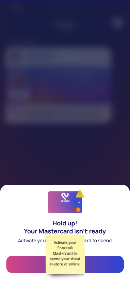
The Add card Modal is updated with a new UX content that introduces transparency. This Modal stays until the users follow the prompt.
Receiving a gift card should be a fun and exciting experience.
Step-by-step activation guide does make it longer to finish the task. Yet, by making it easier to complete the task, it feels faster.
While discussing with the team my ideas and user flows, we have decided on the direction that helps the team update the app within proposed timeline. The wireframe aims to reflect our end goals:
Add ‘hold-up modal’ with a clearer instruction.
Add ‘activate your card’ page. The team agreed that a level of repetition is needed considering our target users’ age and demographic not being tech-savvy.
Add ‘activated card’ page. This page was added to remove the confusion from users who do not use or own digital wallets.
Keep refining the concept for scope and prioritisation
With constraint app update timeline, I approached the prototype with:
Introducing small UI tweaks
Recycling any other components we have used before
Ensuring the UI and UX content consistency between the onboarding and returning flows.
This flow was developed and tested by the sales, marketing and developer team. The sales team had revisited this flow and suggested some UX writing changes.
The successful launch means no more customer support ticket ;)
The Card activation onboarding flow was launched in April 2022.
Since launch, there has been no negative feedback on our updated journey from customer success. This seamless onboarding experience has converted many receiving users to start sending gift card, which helps increase Shouta’s revenue.

