Newtracs is a 4WD navigation app that provides detailed trail information for off-road drivers, helping them choose tracks compatible with their vehicles.
I saw Newtracs as the AllTrails for 4WD.
When I joined the team, the product was designed solely in portrait mode — standard for most map-first apps. But in action, that format quickly becomes limiting. Drivers often dock their phones in landscape mode for better visibility while navigating. And yet, this experience was completely underserved.
To guide my design approach, I framed the challenge with a key question:
How might we reduce visual and interaction clutter while still keeping essential controls and context within reach?
My Approach
Audit the existing portrait experience
Define the information hierarchy for active navigation
Reimagine the layout in landscape orientation
Run concept usability testing with 4WD users
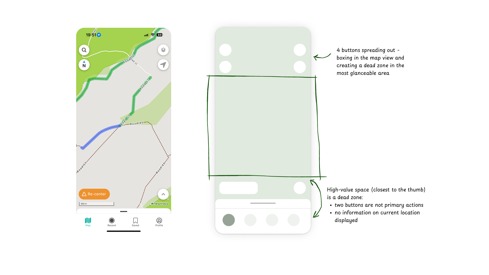
Where the portrait view falls short…
Even though the portrait experience followed common map conventions, it introduced three core usability issues:
Top-heavy clutter Four elements on the top of the map. By introducing multiple tap-able elements in small space restricts users from tapping on the map itself.
A bottom zone doing too much — but not enough The bottom of the screen overwhelms the most tapped and thumb-accessible area with no relevant information or context or any primary actions.
Glance-ability gap The tray was collapsed by default, yet provided no useful info until expanded. For drivers, this meant pulling a tray just to confirm basic context — not ideal in a high-focus environment.
How others do it
Apple Maps surfaces personal locations (Home, Work) as entry points, optimising for setup.
Google Maps leads with context — current location, nearby places, and intelligent suggestions.
Waze is fully navigation-led: speed, alerts, and destination info are always surfaced and tap-prioritised.
These patterns all reinforce one insight: relevance comes from anticipating what the user needs to know or do next.
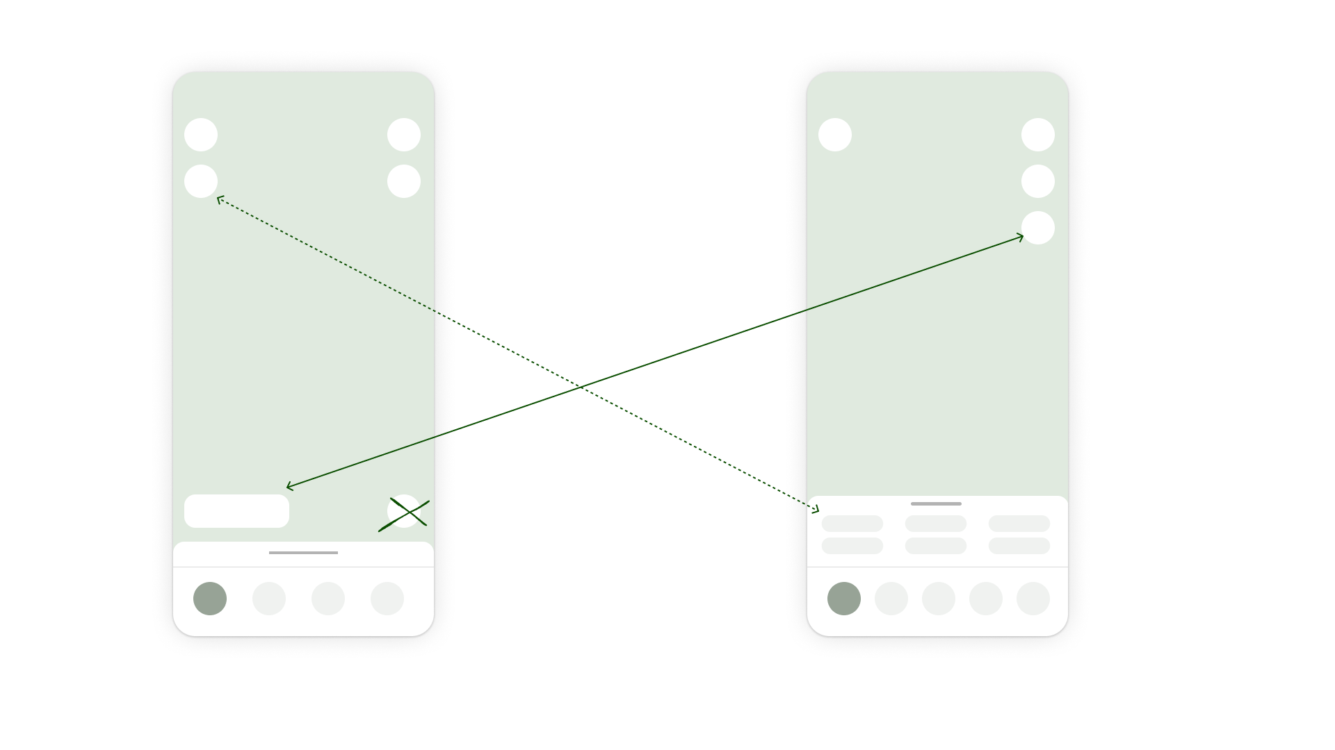
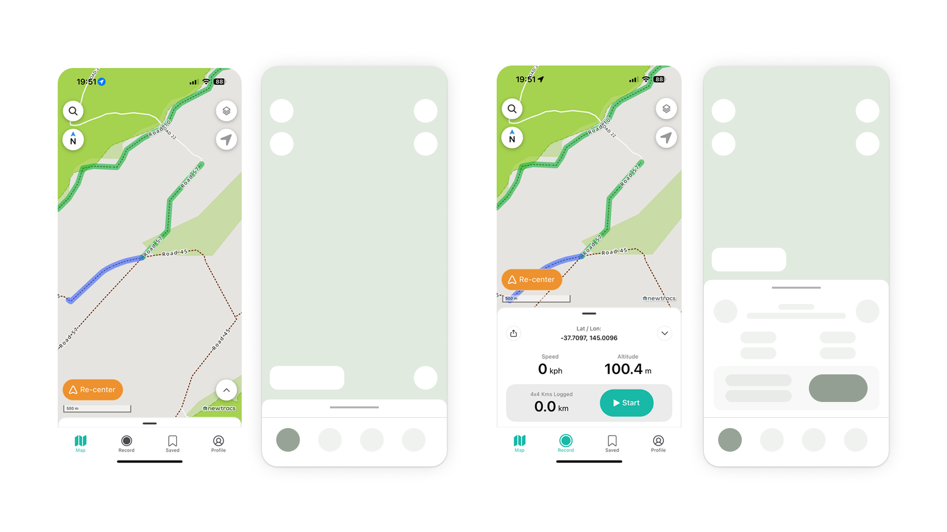
Addressing the dead zones
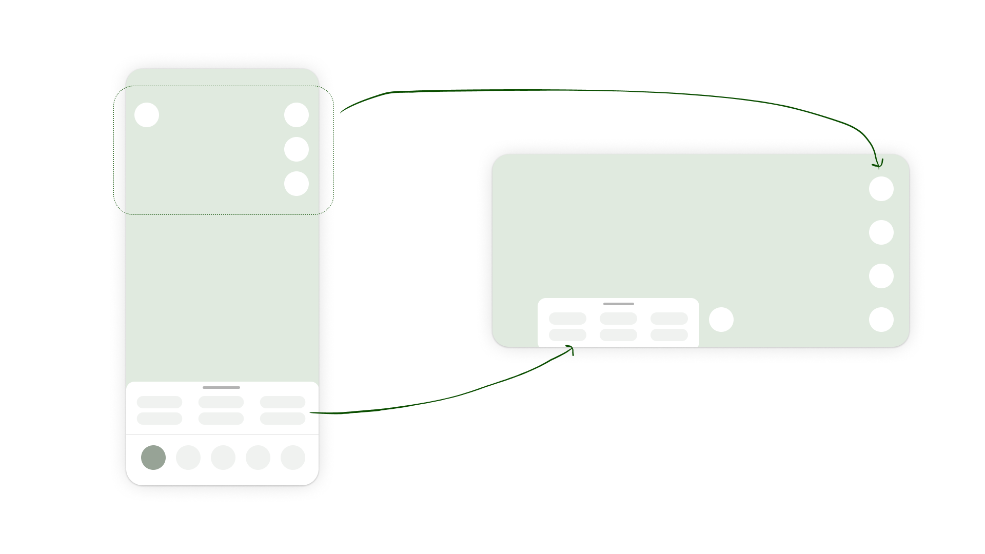
Free up the top tap area
I removed the floating re-center button and grouped it with the main controls in the top-right cluster — now reduced to just 3 buttons. Only the search icon remains on the top-left for balance and quick access.
Reclaiming the bottom zone
I removed the tray expand button — relying instead on familiar swipe gestures. With the 2 floating buttons removed, I freed up the bottom for map space.
Surface relevant contextual information, while hiding deeper context away
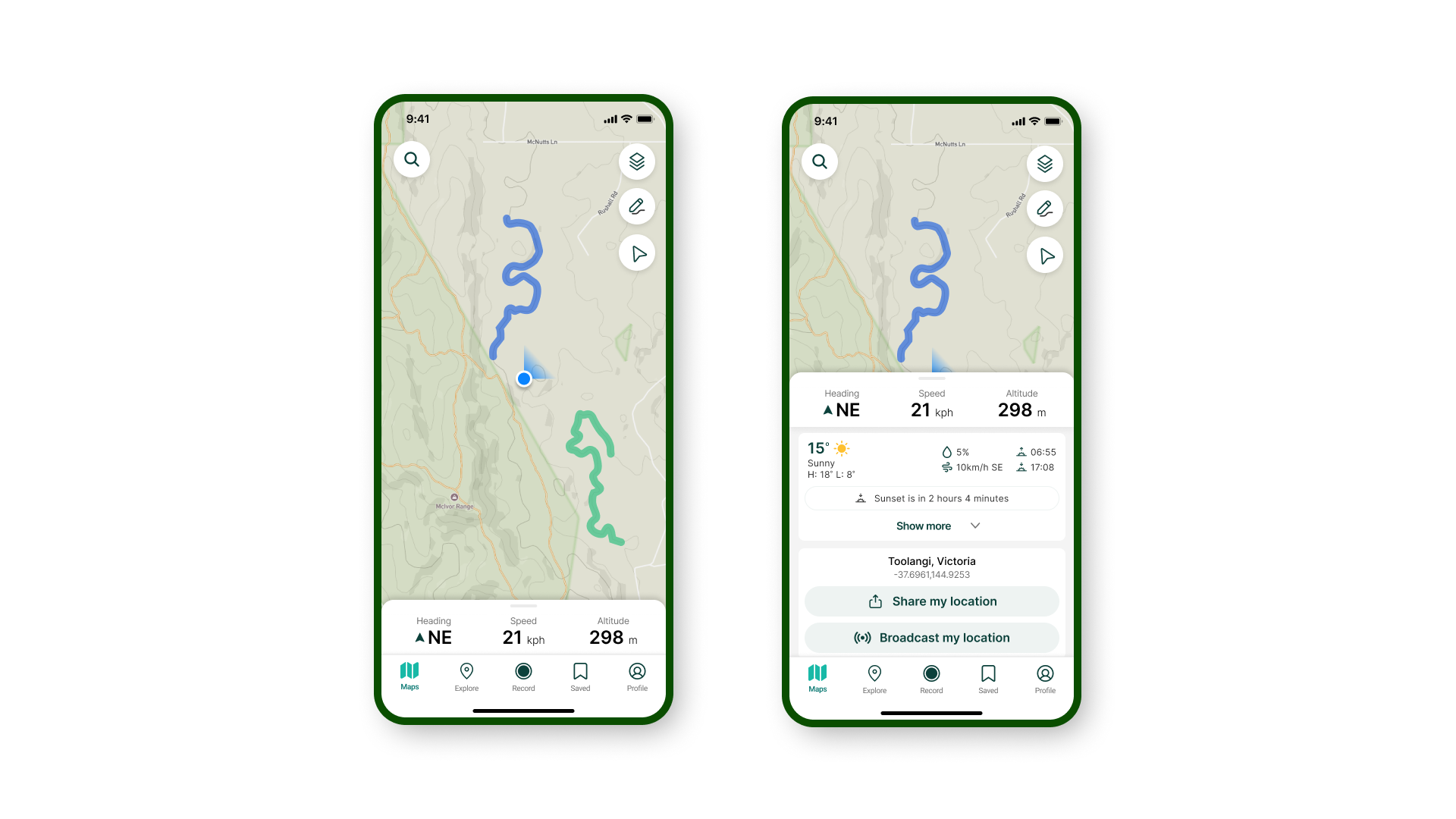
I embedded key real-time info in the collapsed tray: Speed, GPS coordinates, Altitude
Once expanded, the tray reveals deeper context: Tide times, Weather conditions, Sunlight hours
This made ambient awareness possible without added interaction friction.
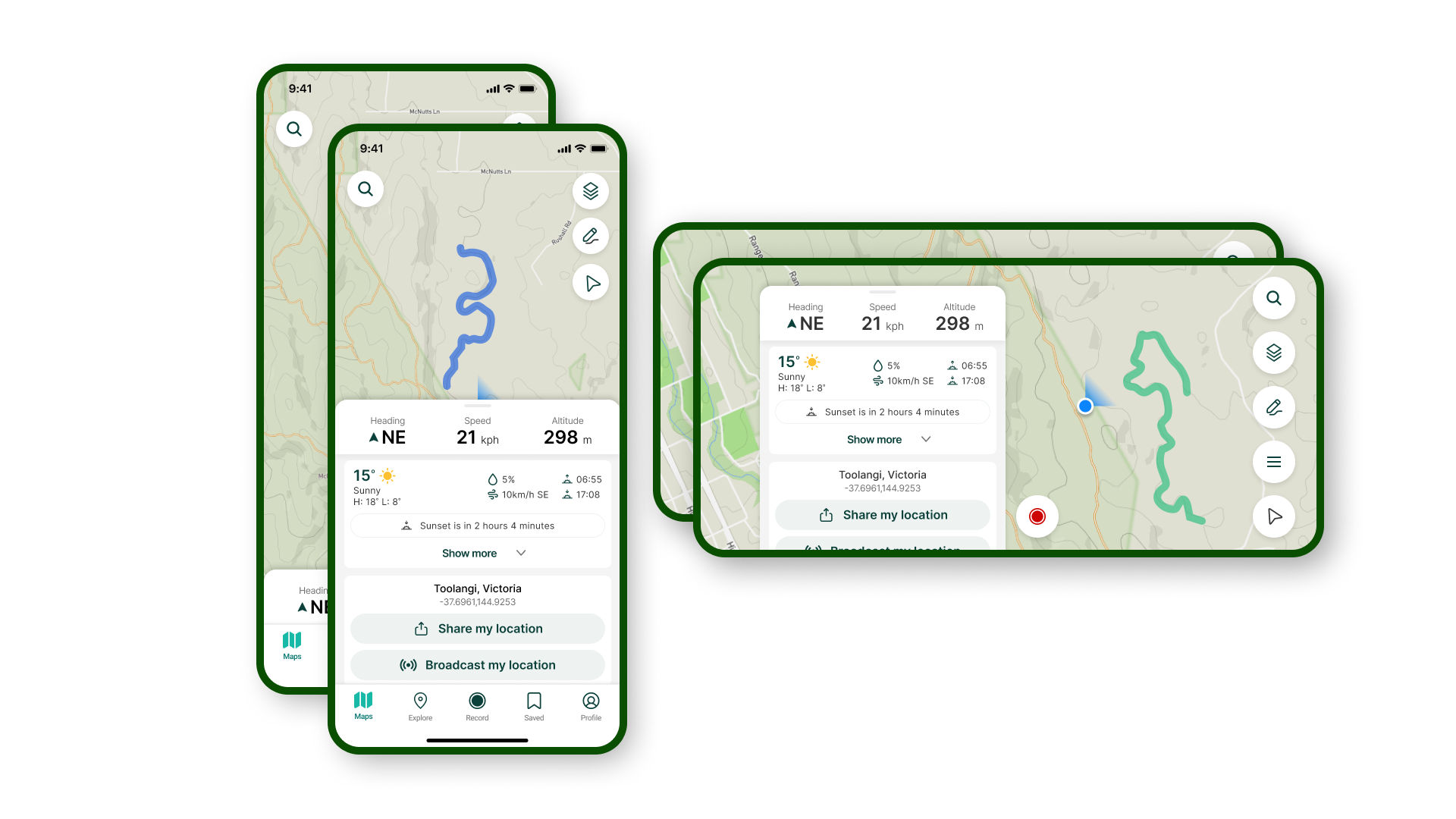
Designing for Landscape Mode
After refining the portrait layout and clarifying the information hierarchy, I turned my focus to landscape mode — where many Newtracs users actually spend most of their time while driving. The approach is to:
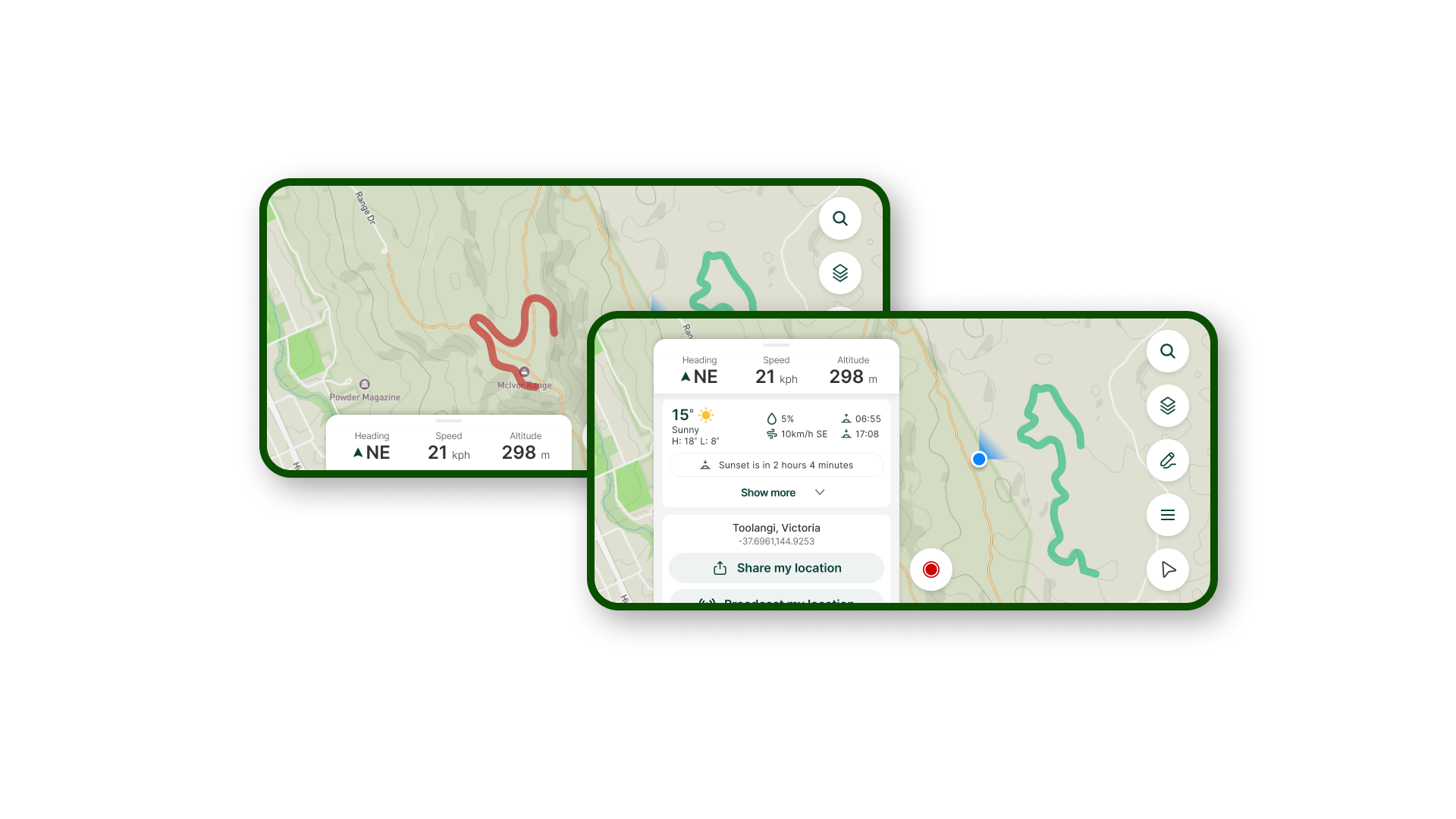
Surface the most-used actions without overwhelming visual hierarchy
Adapting controls for thumb-accessibility and glance-ability in a sideways screen
Real-time info remains anchored
The collapsed tray — now redesigned with glanceable speed, location, and altitude — remains in the bottom left in landscape mode. This preserves spatial memory from portrait and maintains visibility of essential, passive info.
Primary actions, right where you expect them
I identified and prioritised key actions like: Search, Route Builder (Newtracs’ USP), Map layer, Re-center
These actions are now grouped and stacked on the right edge of the screen — easily reachable when docked in landscape.
The Record button is visually elevated as a floating action — supporting one of the core use cases: capturing and contributing trail data while driving.
Navigation drawer replaces bottom nav
The portrait experience used a standard bottom nav. In landscape, this would consume too much horizontal space — so I replaced it with a right-side drawer, revealing secondary features like Settings, Profile, Saved Trails etc.
This decision was based on feature priority: users navigating a trail don’t need full app access at all times — just what’s relevant for that moment.
Rather than mirroring portrait mode 1:1, I treated landscape as a distinct experience, optimised for in-car use and horizontal reach.
What I’d validate next
1. Usability Testing Plan
I’ll create a high-fidelity prototype of the new landscape layout and run sessions with active or potential Newtracs users. The goals are to understand:
Navigation clarity: Can users get from point A to point B with the relevant context visible (speed, location, altitude)?
Information architecture fit: Does the new layout support their key tasks, or introduce new friction?
Primary action performance: How easily can users: navigate, search, record, route building or change their settings
I’ll prompt them with real-world tasks, observe their flow, and capture both quantitative metrics (completion, time on task) and qualitative insights (where they hesitate, where they expect things to be).
2. Heatmap & Interaction Tracking
The plan is to collect tap/click heatmaps to identify:
Most-used actions and gestures
UI elements that are ignored or misinterpreted
Dead zones or high-friction areas
This helps validate if the hierarchy I designed matches real-world behaviour — and gives me clues on what to refine next.
3. Empathy Mapping
Beyond usability metrics, I’ll follow the core journey maps and actively look for: Mis-taps or repeated actions, verbalised confusion or hesitation. This helps me identify subtle friction points that may not appear in pure analytics.